A UX-based redesign of the applications for personal deposit accounts.
When I was initially assigned to this project in early 2019, the platform had recently undergone a major back-end technology upgrade, but the front-end needed a little extra attention. Pages were organized in unintuitive ways, content was confusing yet overly verbose, and the application seemed long and unwieldy.
Designing for KPIs
When embarking on the redesign, we were given a few targets to keep in mind while designing
Achieve an average time to complete the application below 5 minutes
Increase the submit rate
Lower the overall bounce rate, with a focus on the very high first page dropoff rate (shown left)
Surveying the Competition
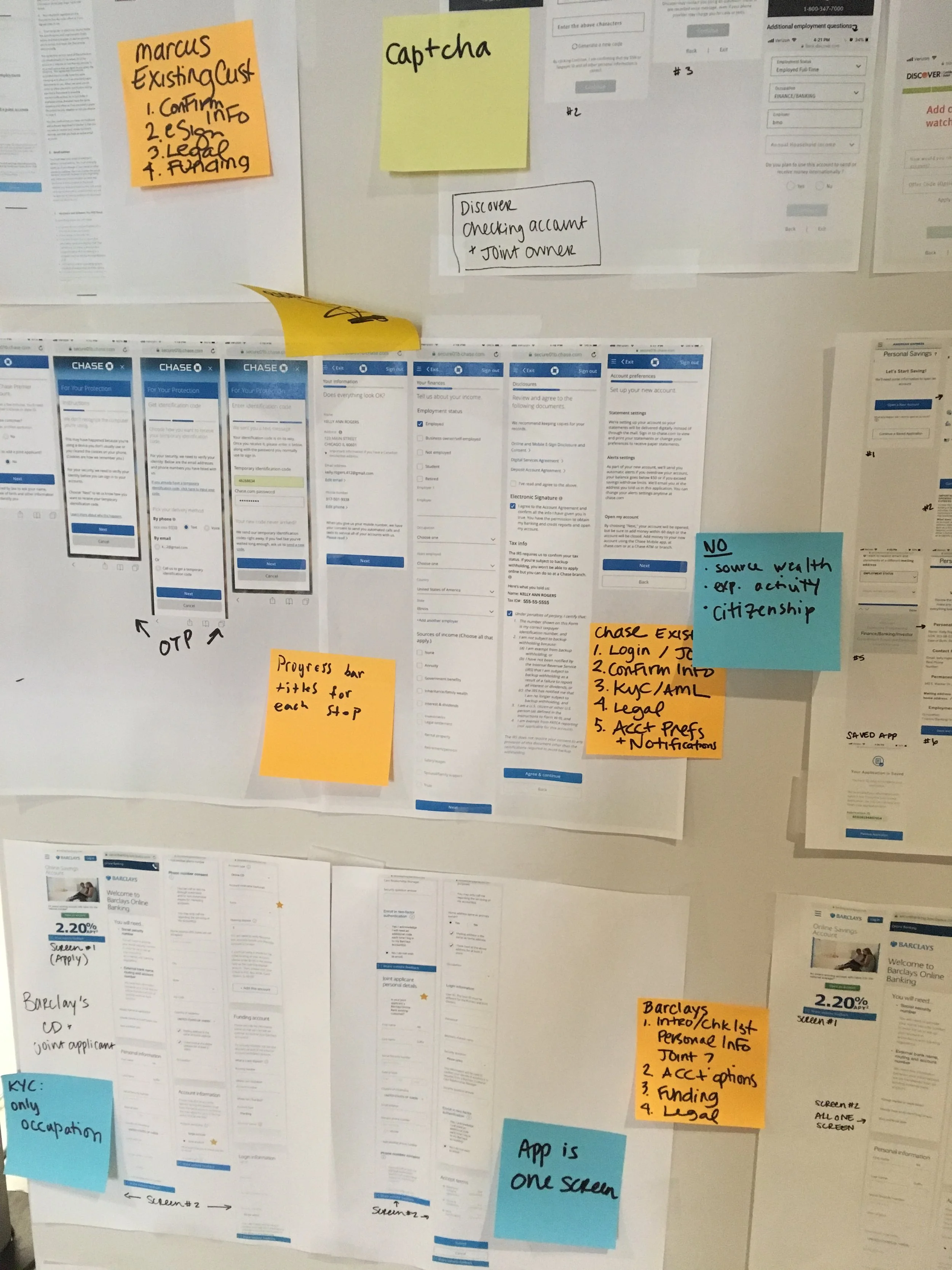
We began the process of the redesign by investigating the checking and savings account applications of nearly 20 competitors. Printing them out to create a physical installation in the office, we took detailed notes on all the applications to note what they did right, what they did wrong, and what we could learn from each of them.
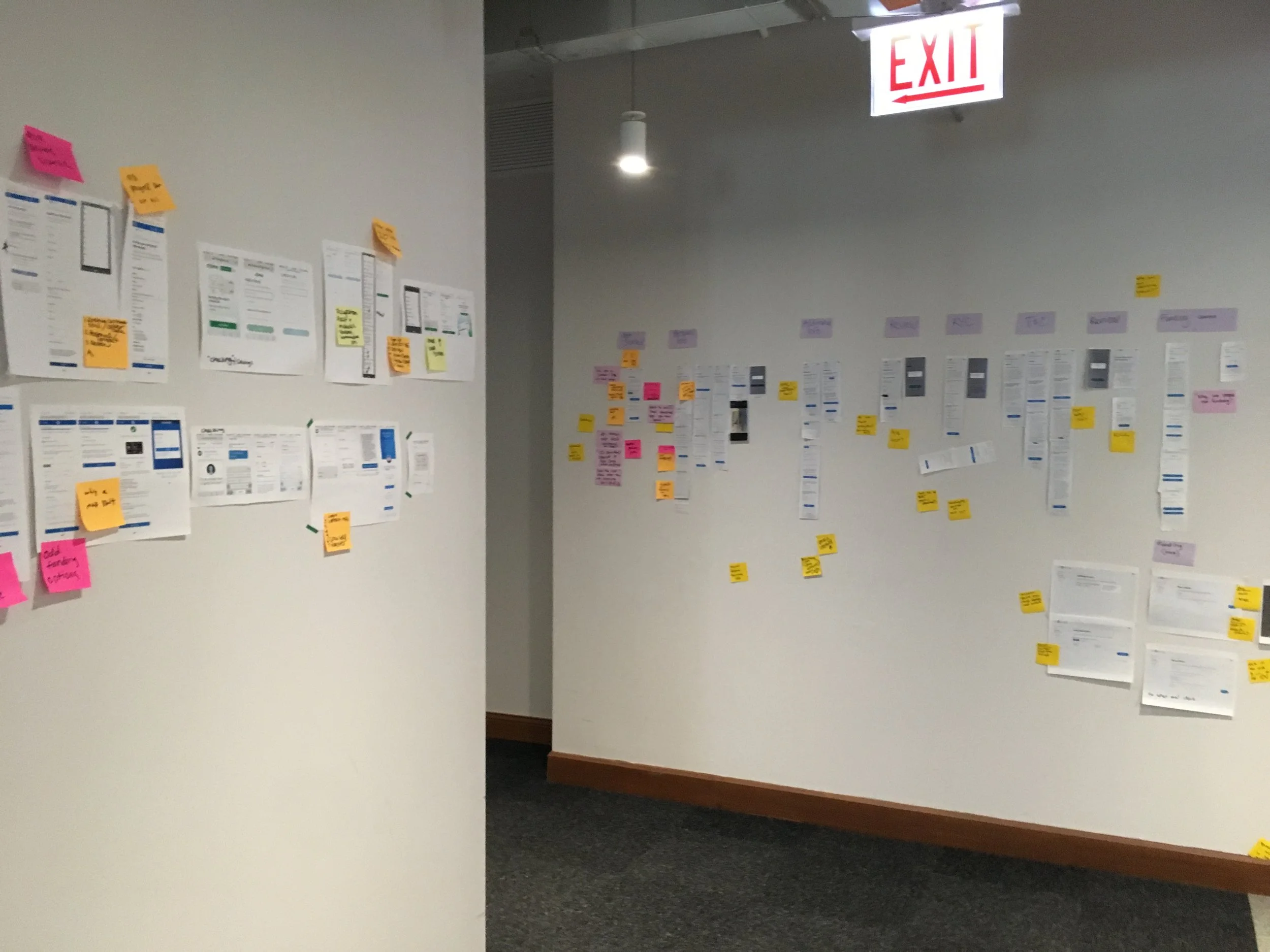
Finding a Baseline
We also, working with our UX researcher, conducted baseline usability testing on the current state of the deposits application. From that research, as well as the competitive research shown above, we identified a few key areas to focus on improving:
Perceived length and complexity of application
Confusing content and language
Unnecessary and complicated questions regarding personal finances
A few examples of these issues are highlighted in the images below.
Advocating for the Users
One of the most challenging parts of many projects can be working with partners and stakeholders. In this case, we needed sign-off from legal, compliance, and risk partners to remove the sections of the application that our testing had identified as causing the most confusion in our users. By bringing our research findings to these discussions, as well as using competitor examples as benchmarks of what was theoretically possible, our team was able to achieve success in streamlining the application.

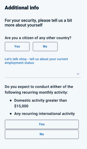
Many users found the casual tone of this content off-putting
Inconsistent formatting made it easy to miss key questions, and the question about monthly transactions was nearly incomprehensible to lay users
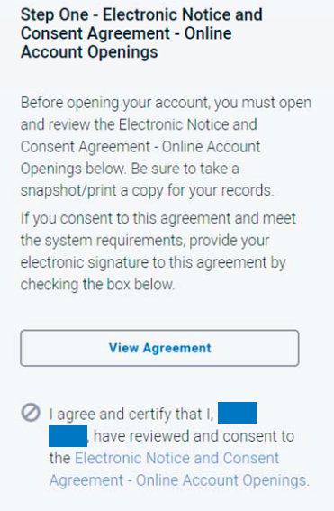
Legal documents were unveiled via progressive disclosure, which took multiple clicks to view all documents. The emotions provoked in users were frustration and impatience.
Searching for Structure
Through our competitive survey, we noticed there were two main patterns in the applications we saw: long applications with only one or two questions per page, and shorter applications with all questions collected onto a single very long page. I created interactive versions of both prototypes in Axure, and we ran an A/B test comparing the two versions against each other, searching for user comprehension, missed questions, and perceived complexity.
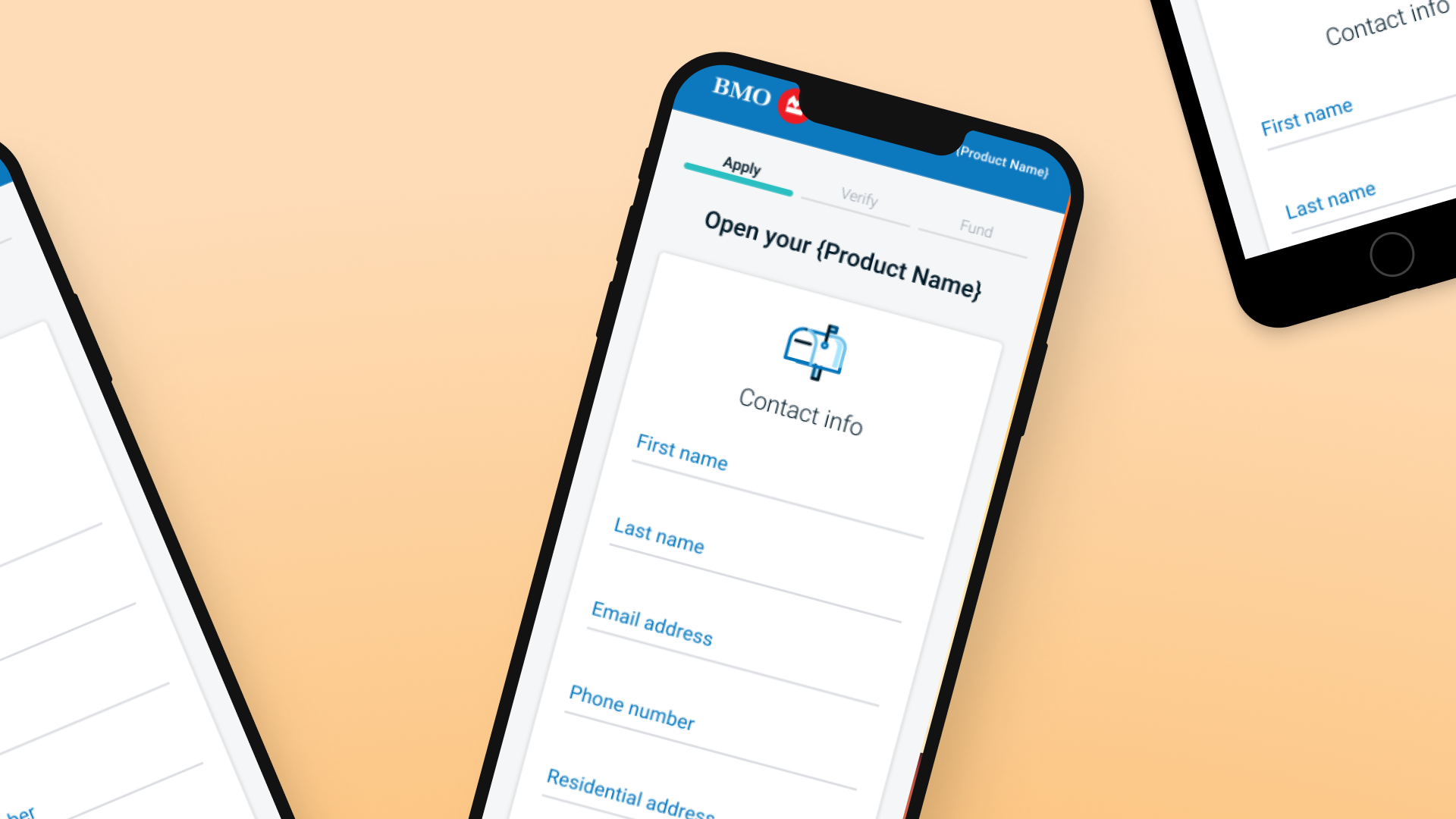
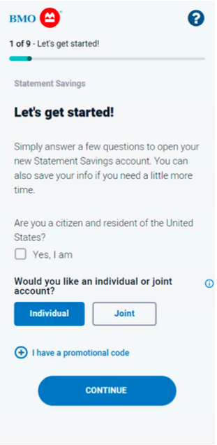
A/B tests in laboratory conditions, however, rarely produce conclusive results, and our versions performed very similarly with users. Bearing in mind that one of our key project goals was to reduce first page dropoff, we erred on the side of transparency and decided to design a version with three pages: application questions, user verification, and funding. All personal and financial questions would be front-loaded on the first page, so users would be able to view the entire application before beginning.
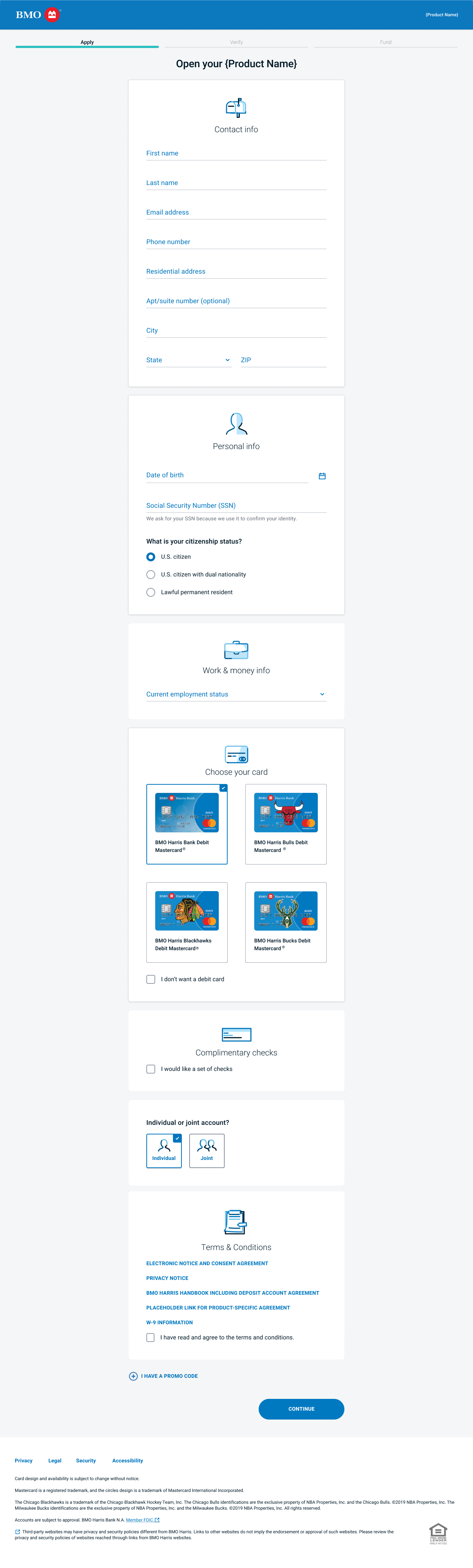
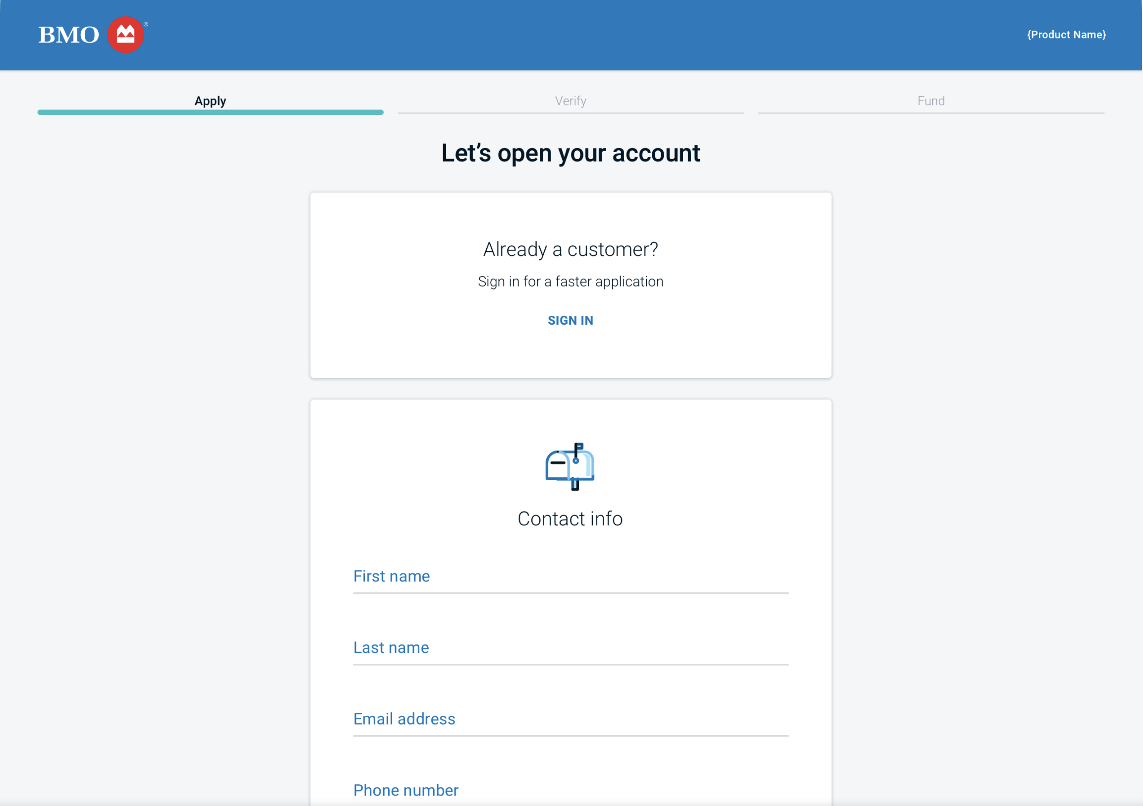
The "apply" page, where all user information is collected
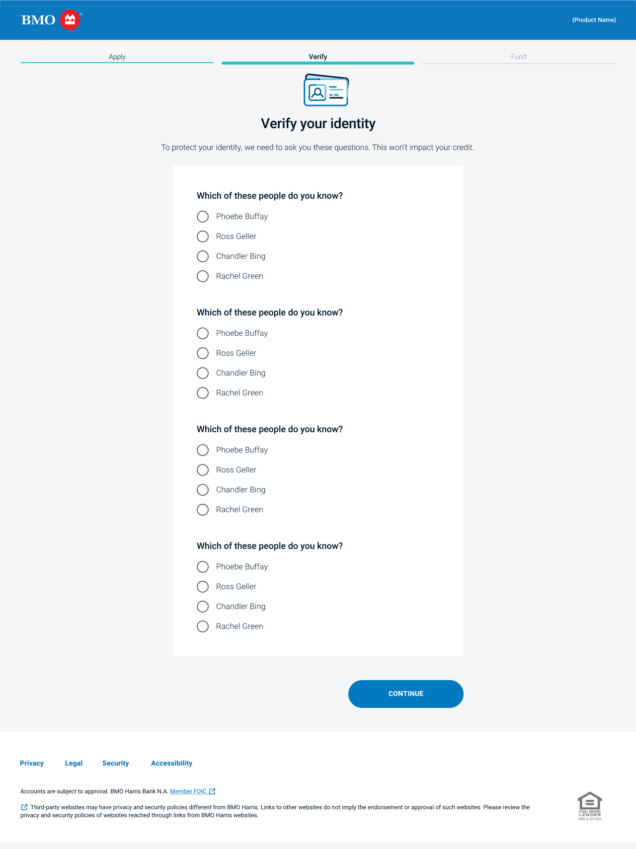
"Verify" page, where users identities are authenticated in order to prevent fraud, etc.
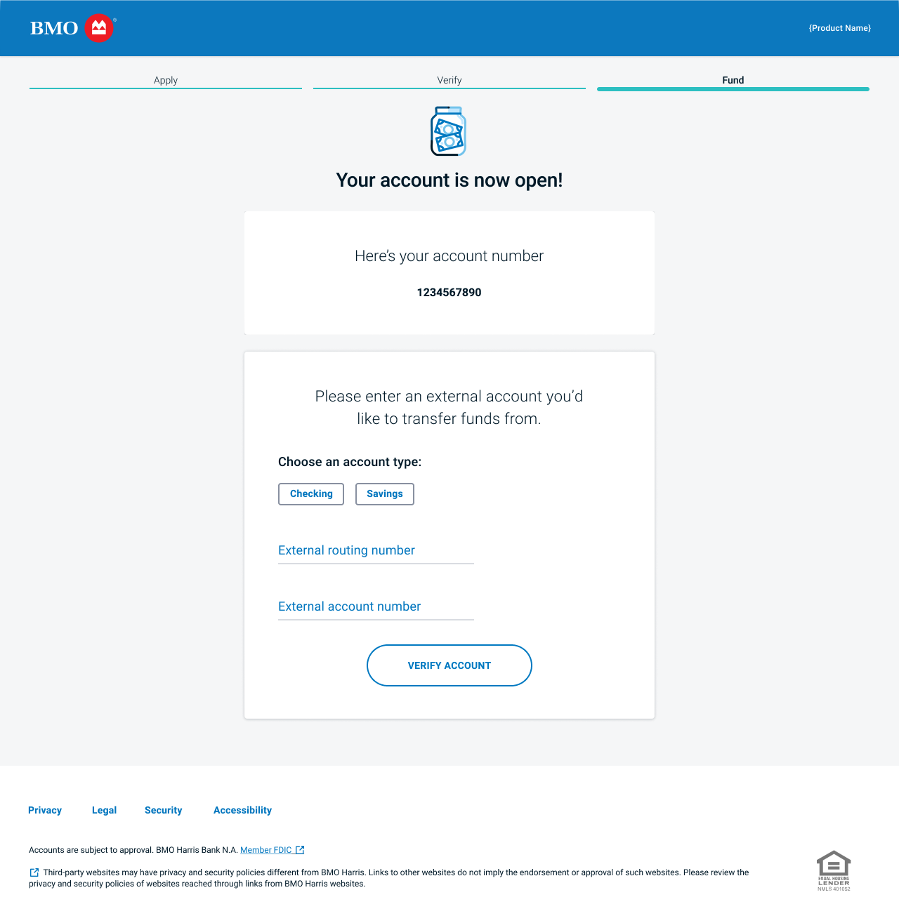
Funding page, where users can transfer money from their previous accounts to the newly opened one
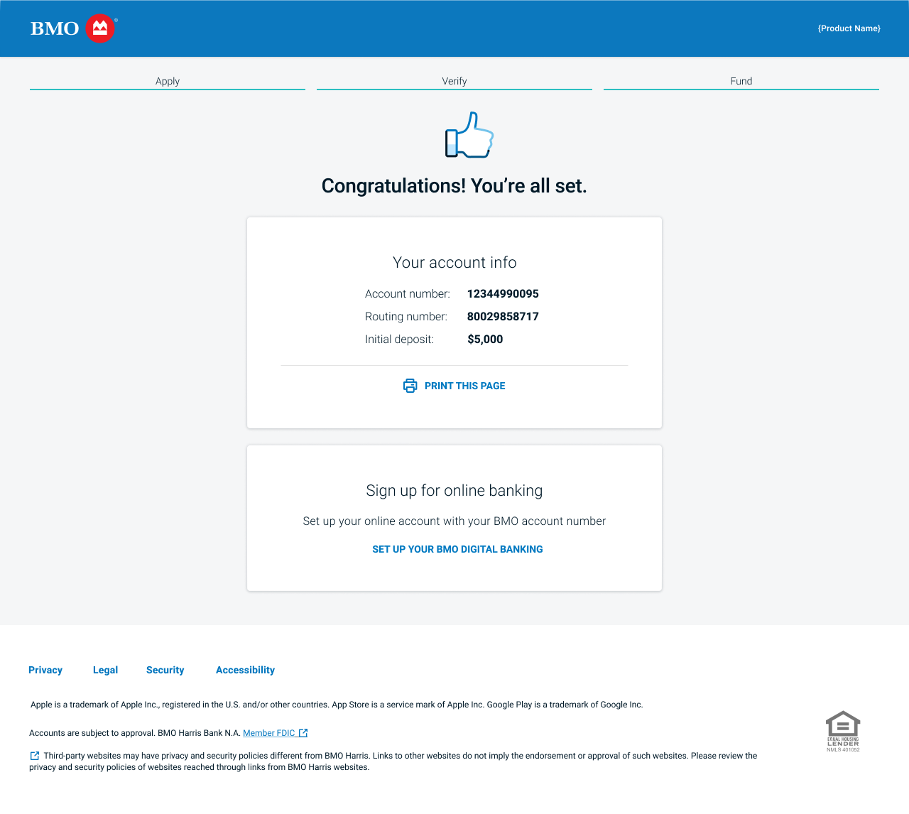
Confirmation page that reiterates important account information to users, and invites them to enroll in online banking
Using analytics to measure success
After the solution presented above went live to the public, analytics were key for validating that our redesign delivered on the KPIs and goals established at the outset of the project. After time, we found that our redesign:
Increased submit rate approximately 10 percentage points YOY on average across all products. (e.g. some went from 39% to 49%; others went from 13% to 21%, etc.)
Lowered dropoff rate on the first page
Average time to complete application was lowered by around 90 seconds, from nearly 6 minutes to just above 4.
Continuous improvement
After delivering this update, I led design of several other key initiatives to this project, such as:
A ‘fast path’ for existing customers to authenticate themselves and profile information
The ability for users to open multiple accounts at once in ‘bundles’
An overhaul of the funding/money transfer experience.
These initiatives are shown at very high level in the gallery below.
Fast path: Apply page with CTA inviting existing customers to apply
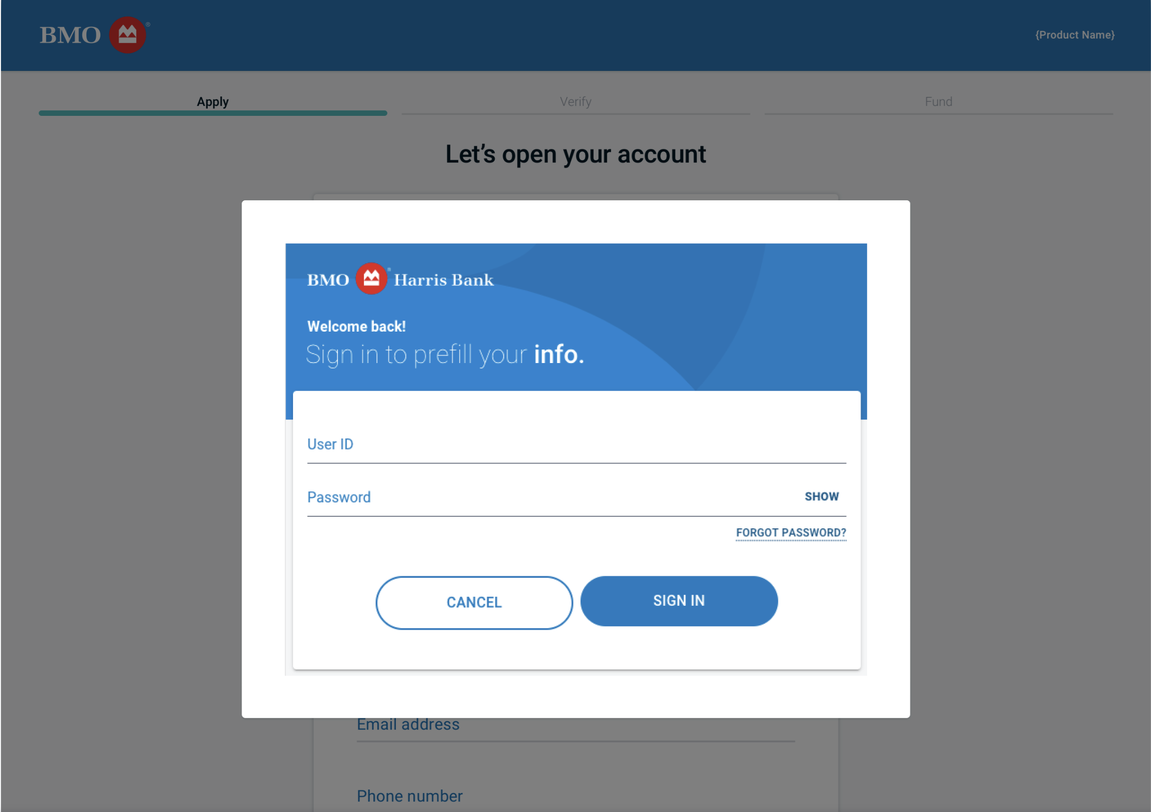
Fast path: verification/login modal
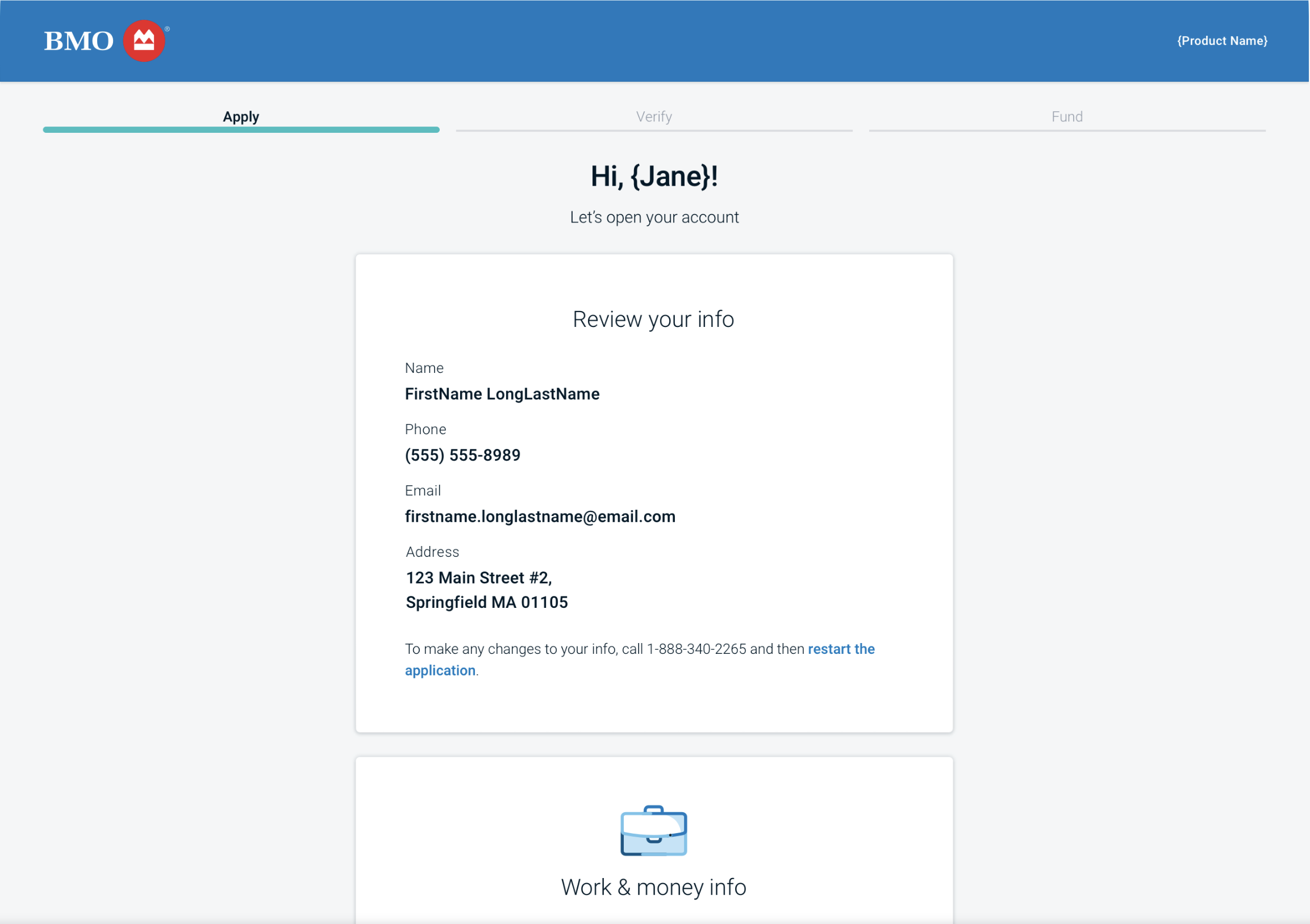
Fast Path: Apply page with prefilled info block
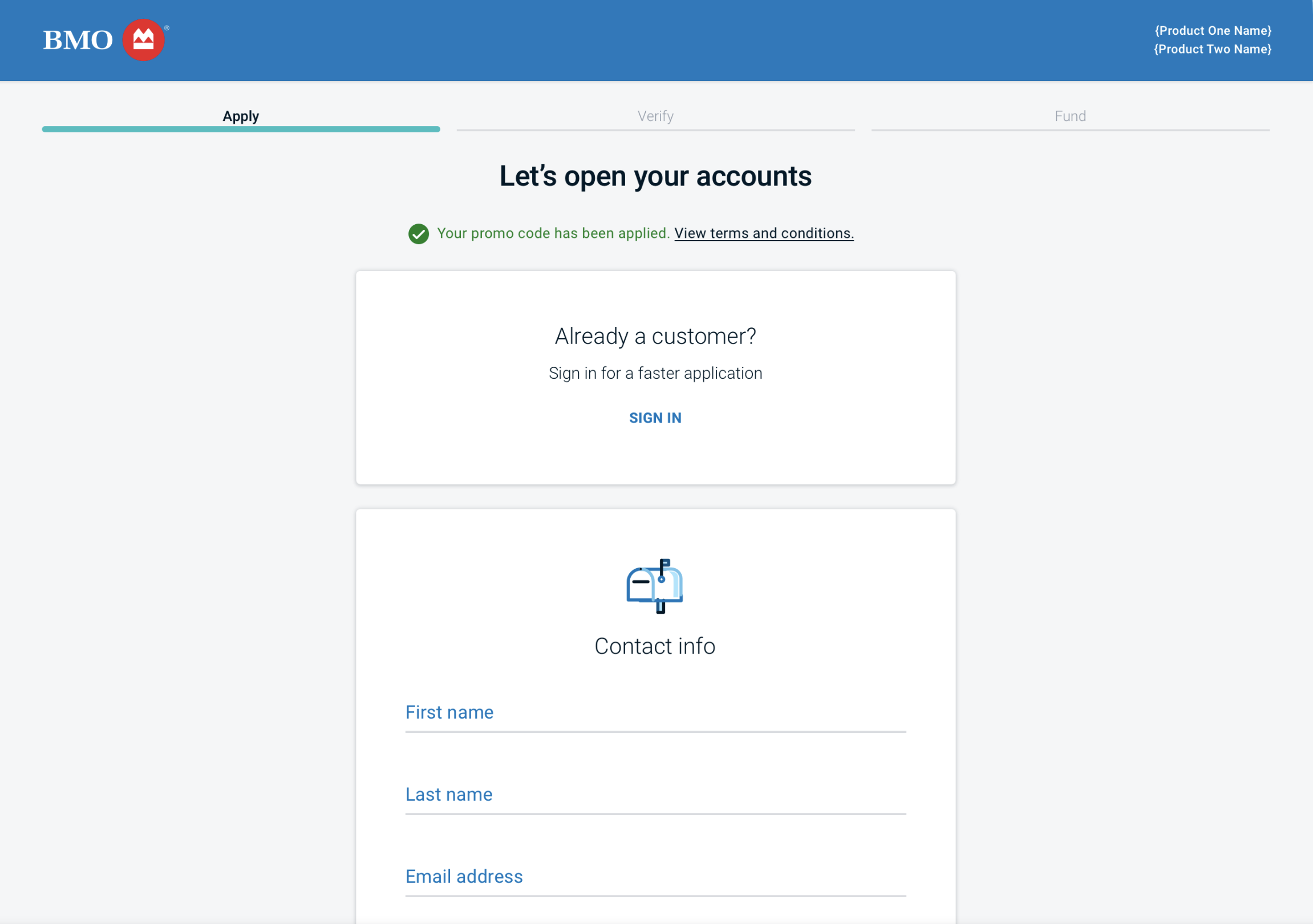
Account bundles: Apply page showing multiple accounts + promotion code added
Account bundles: Multiple accounts on funding initiation page
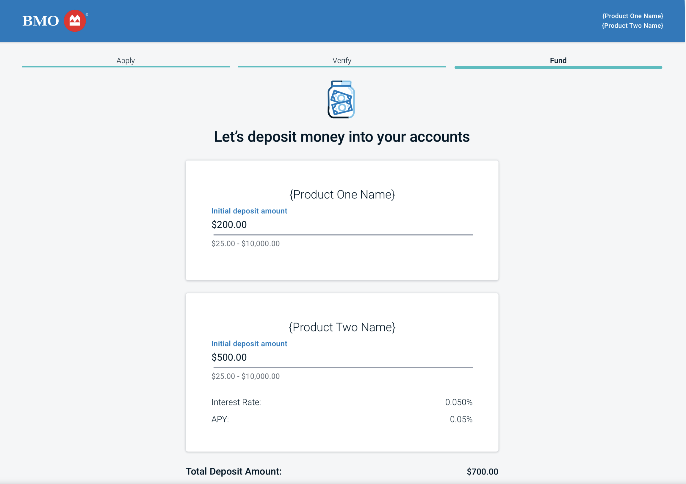
Account bundles: Multiple accounts on funding deposit page
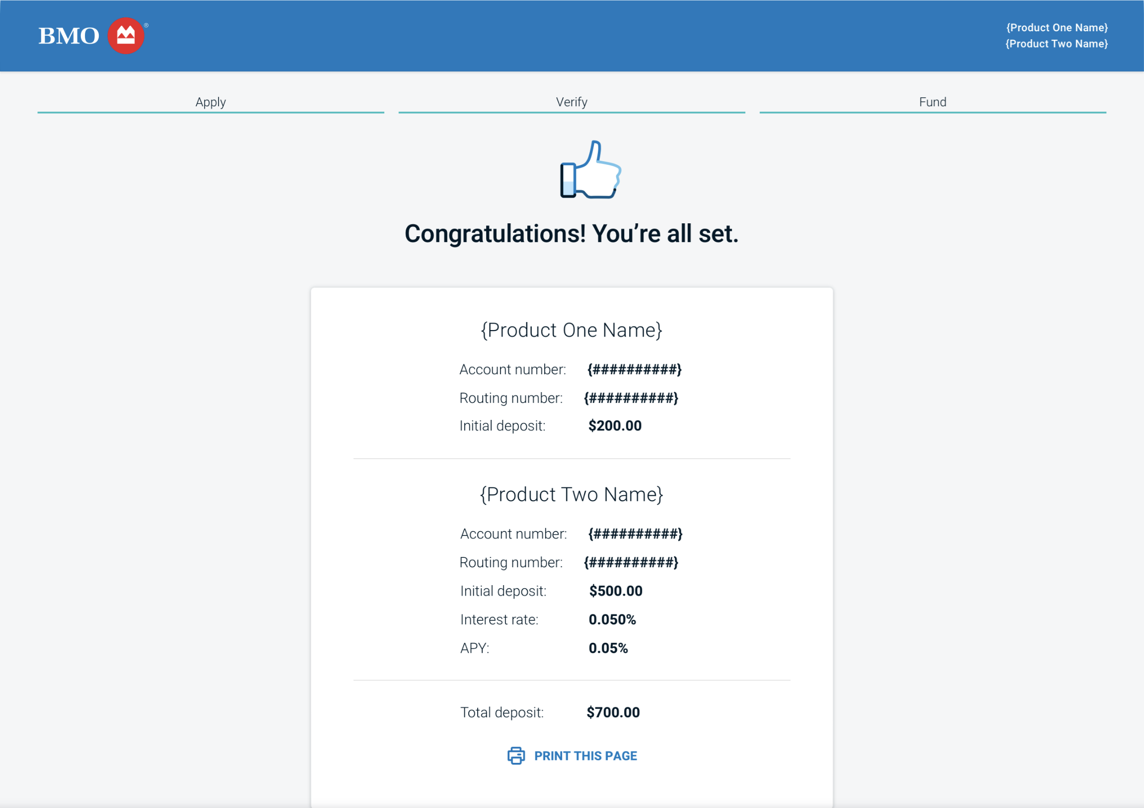
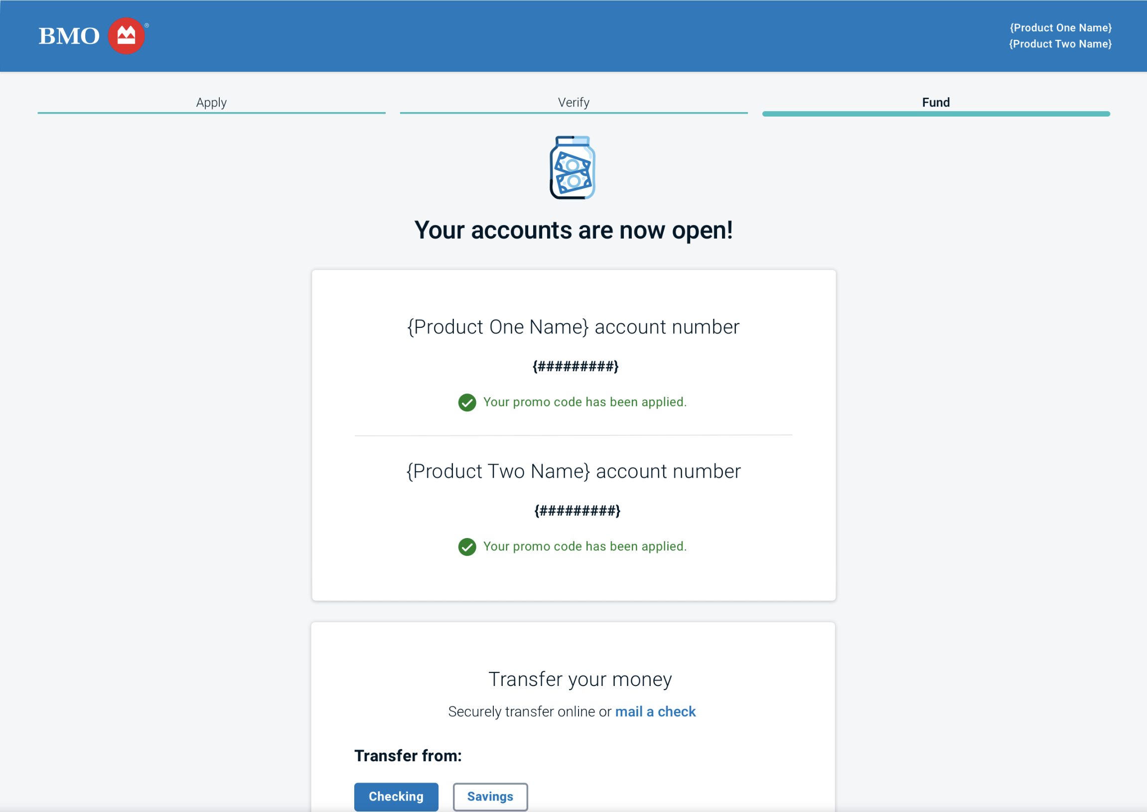
Account bundles: multiple accounts on confirmation page
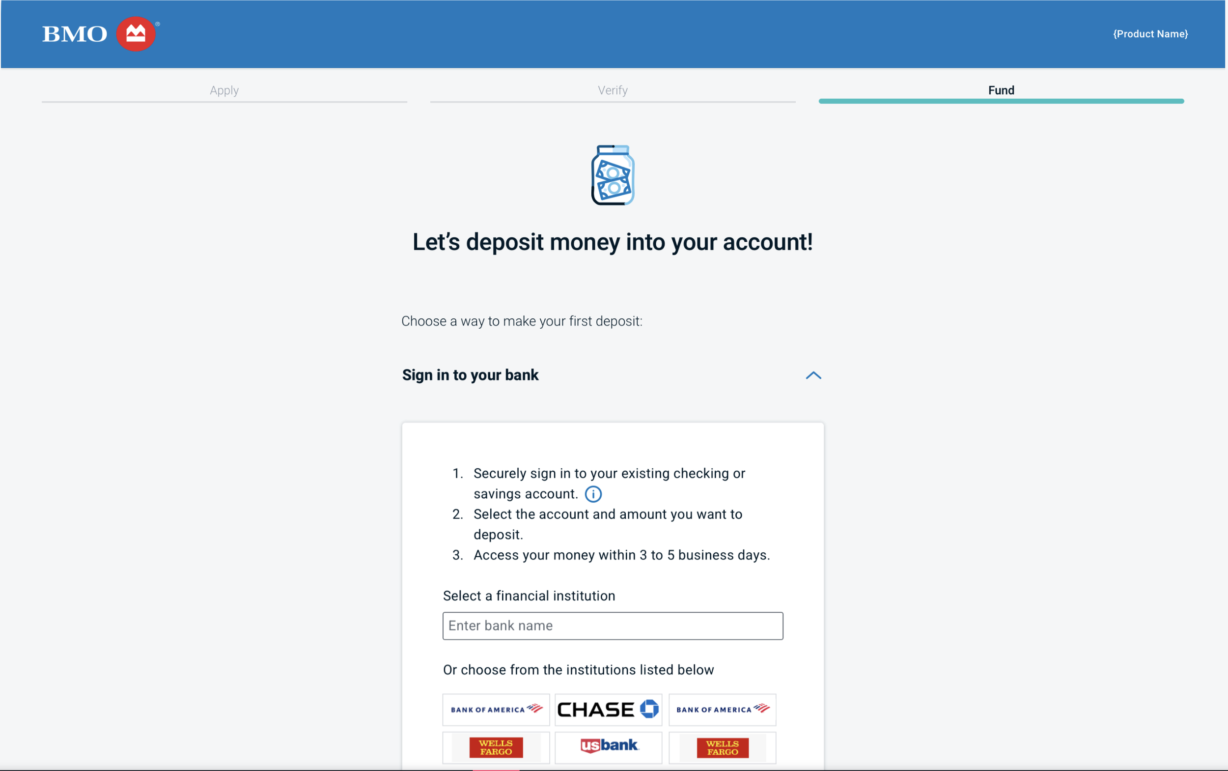
Funding redesign: modernized ACH widget embedded in page
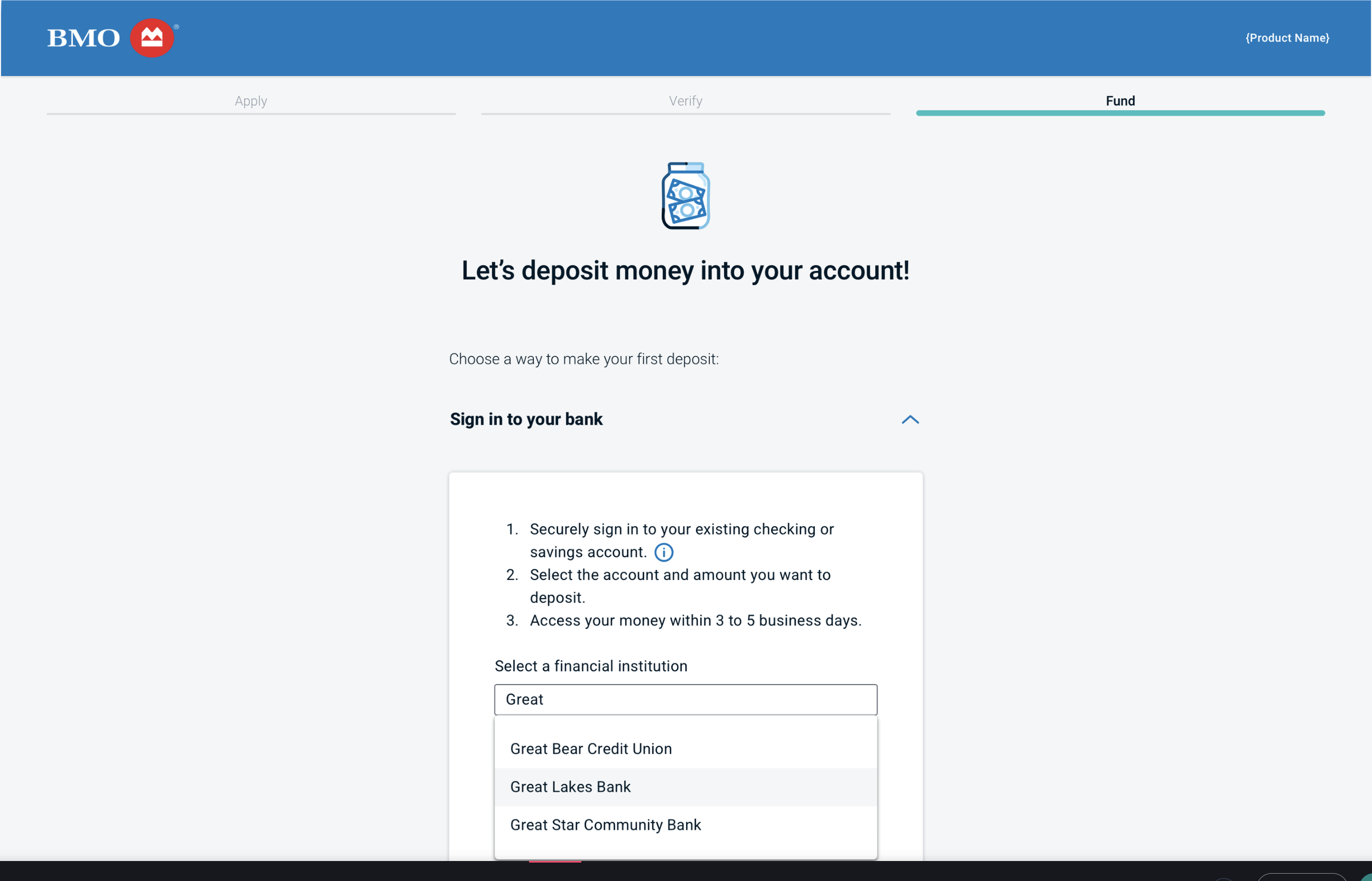
Funding redesign: ACH widget showing institution search
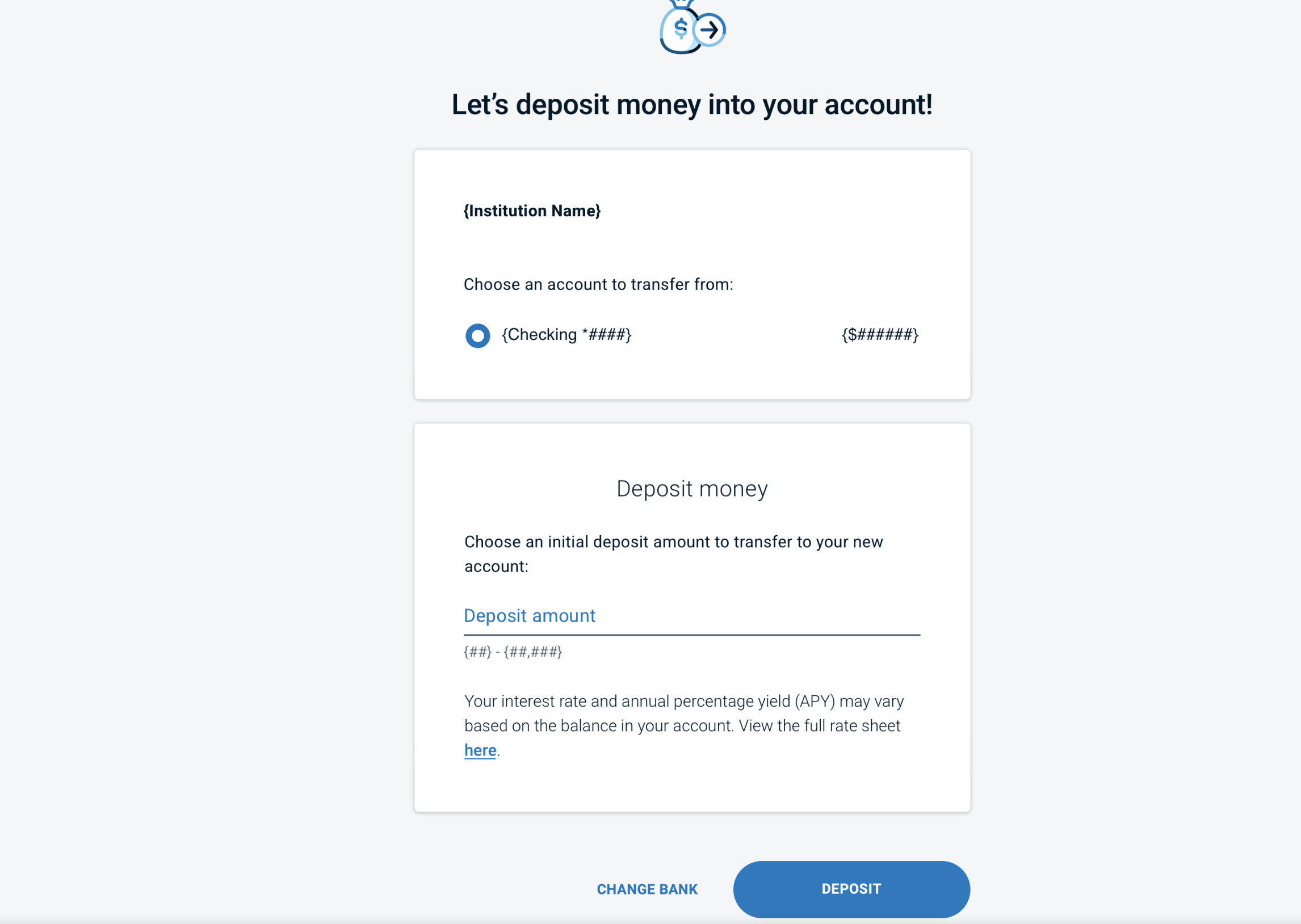
Funding redesign: updated view of deposit page