A complete overhaul of the credit card application for everyday users
The former BMO Harris credit card application was very outdated — it was only available on desktop devices, and only for existing bank customers. For this reason, there was no ability to direct marketing campaigns towards digital applications, and overall application volume was very low (approx 5 to 50 approved cards per month). See examples of the former site below:
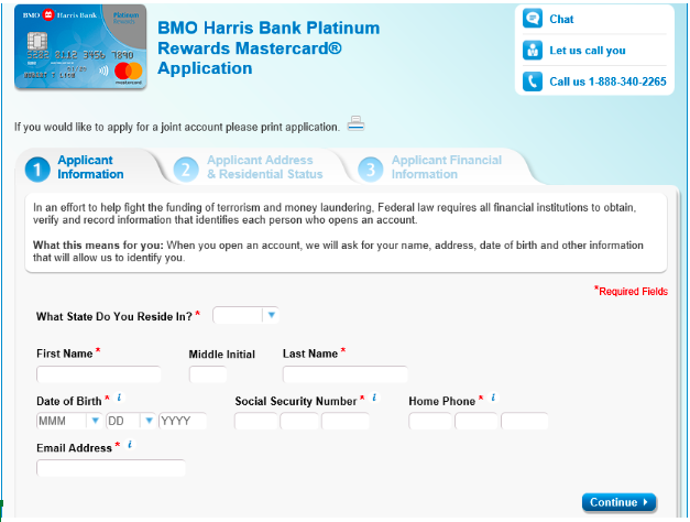
Outdated in look and feel
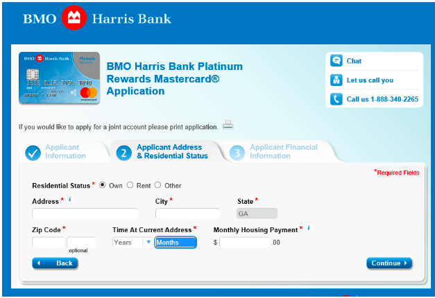
Not particularly user-friendly
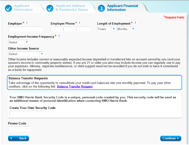
An overwhelming amount of text
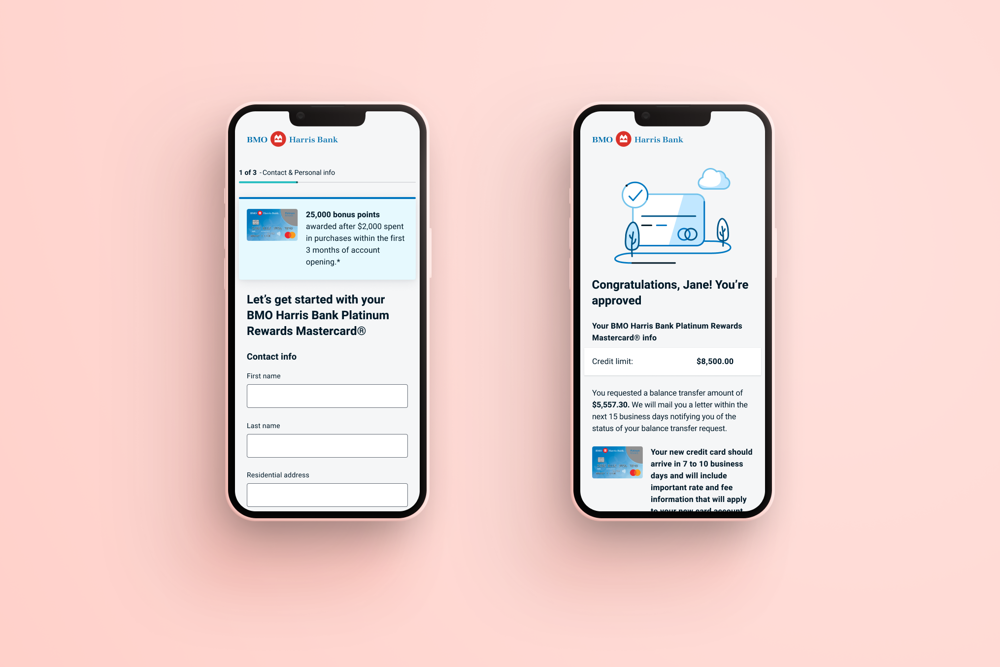
The results of my redesign? A 10x increase in submissions, and an overall submit rate of 75%.
My first step in beginning the redesign process was to complete a competitive survey of the credit card landscape. I investigated the applications of approximately a dozen of our closest competitors, and analyzed them for questions asked, visual style, single-page vs multi-page layouts, and more. This allowed me to get a deeper understanding of market trends and best practices, and presenting this research to my stakeholders allowed them to focus in on what they were and were not looking for in the BMO Harris application.
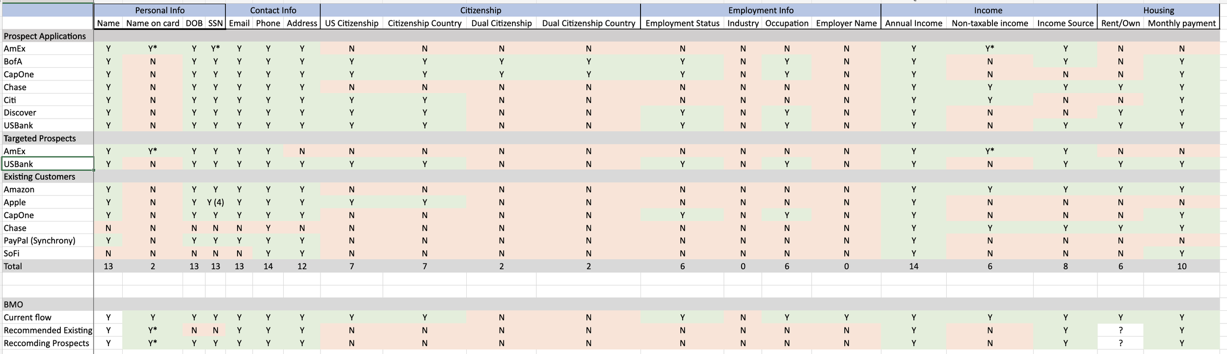
The spreadsheet I created to analyze this data and help sell my decision-making to stakeholders
Initial Concepts
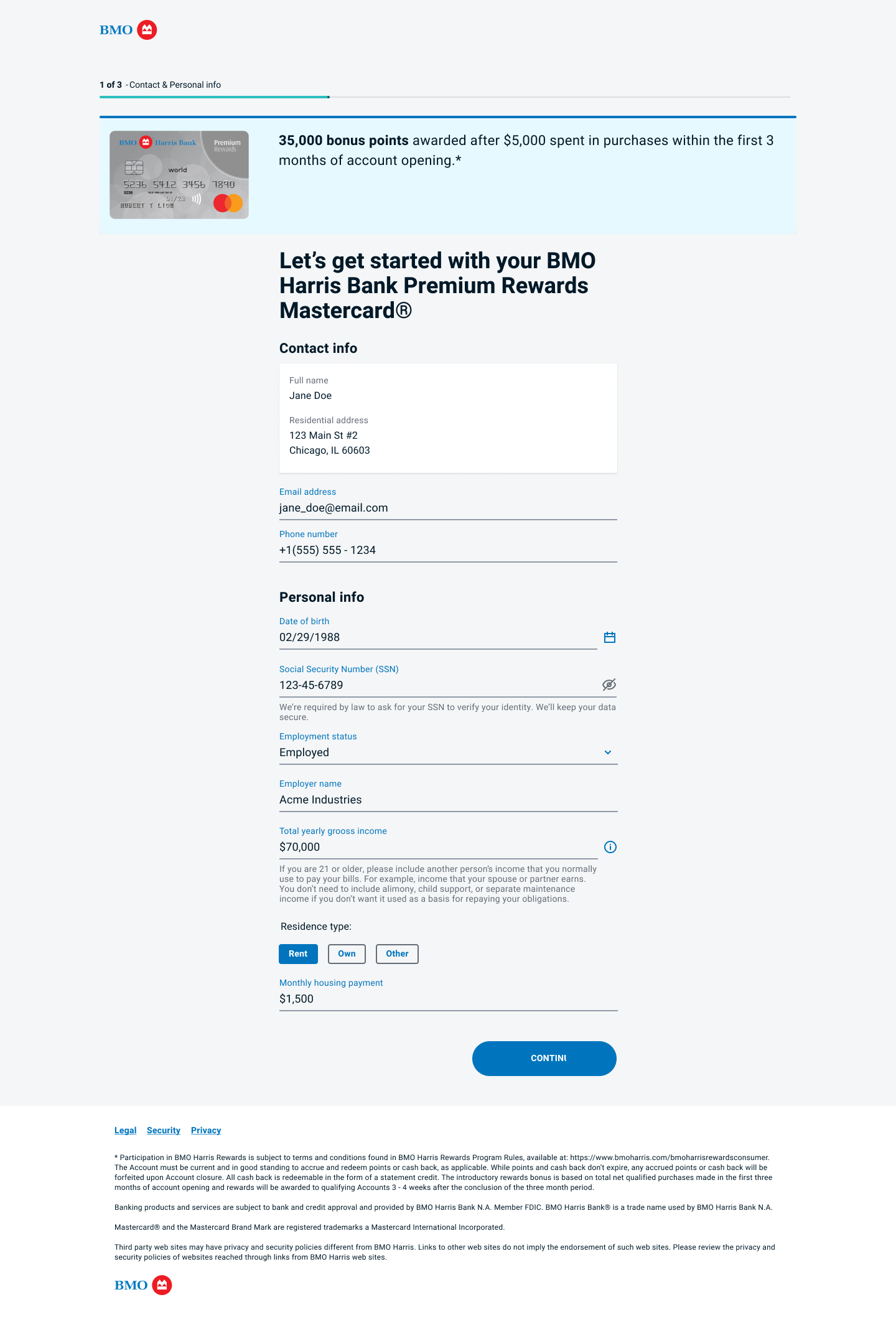
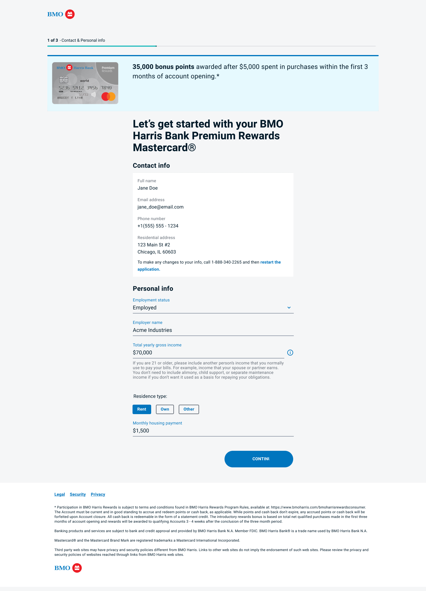
MVP1 focused on applications for existing and targeted customers only. This meant the target audience for the application was exclusively users that we had varying amounts of information about already.
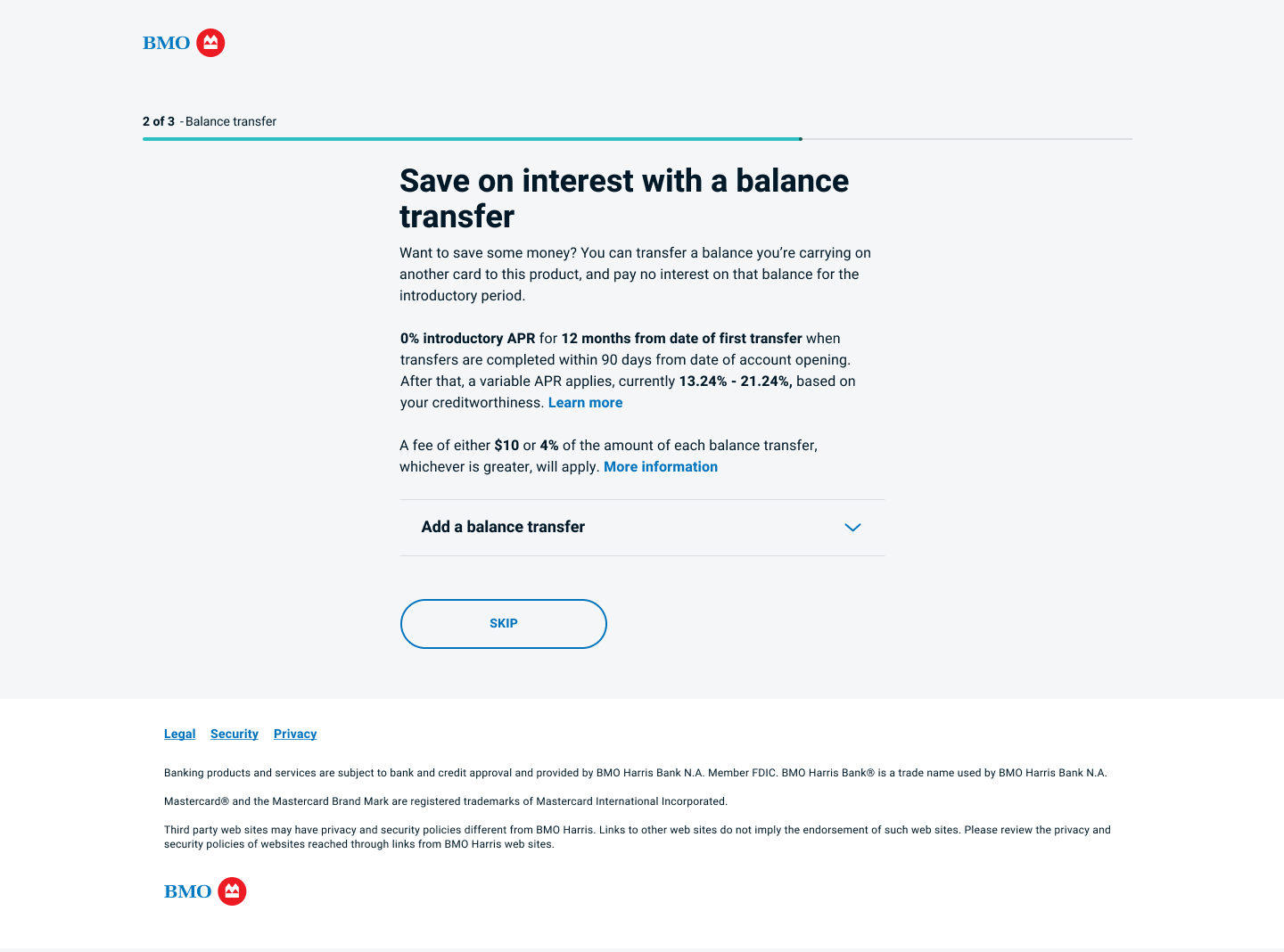
Early drafts experimented with including the balance transfer and authorized user questions on the initial application screen. The application for targeted customers also included the information the bank had on their file pre-filled in text fields, some locked and some not. User testing showed that presenting the balance transfer/authorized user questions in this way allowed them to be easily missed.
Additionally, pre-filling the fields combined with the style of our design system’s form fields made it more difficult for users to scan the application and see which fields were filled and which still needed information.
Final Versions
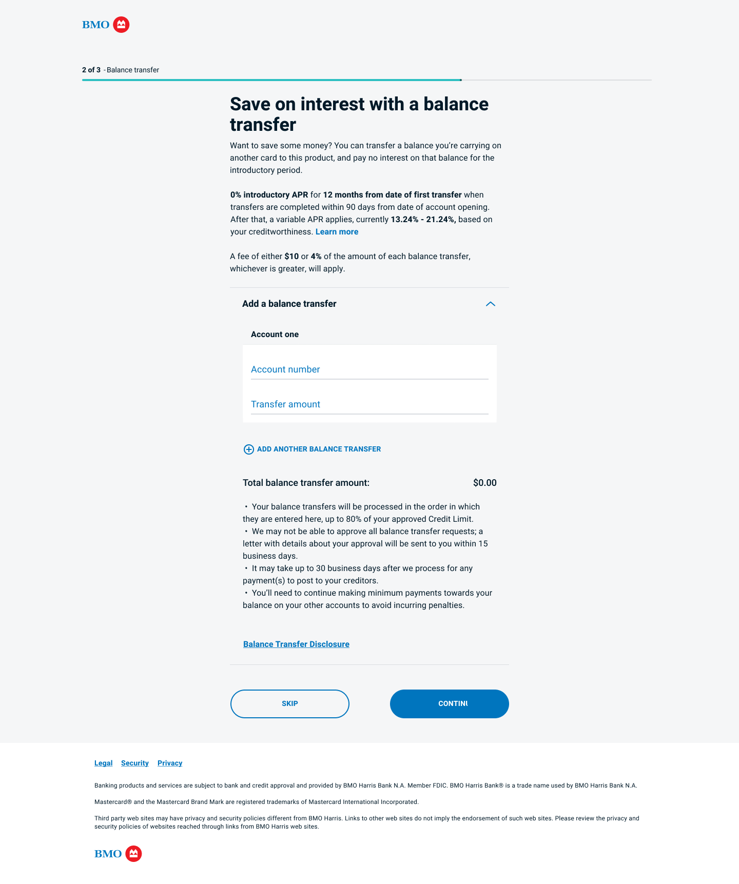
Based on the feedback from user testing, in order to align with the project KPI of dramatically increasing balance transfers along with overall application numbers, I decided to move the balance transfer and authorized user options to their own pages, keeping the fields in an accordion that is collapsed by default (below) but allowing users to easily expand if they are interested (right). User testing and analytics have validated this method; balance transfer rates are up while page drop-off remains low.
The examples above show the final approaches taken for the targeted new-to-bank customers (L) and existing customers (R). Displaying the information already on file on these users in a set-aside block reduces the mental load required for the user to see what information is still required to complete the application.
Ongoing Updates
After the above work was released to the public, the next major initiative was opening up the application to be used by all prospects. In order to approve new customers to the bank who may be higher risk, a “selfie ID” flow needed to be integrated into the application.
A white-label solution had already been selected and customized for other projects, and my task was to leverage this existing technology and balance its limitations with ensuring usability by our target audience. The platform had been optimized for a Canadian audience, and many small but significant changes were necessary for our base of US-only applicants. In addition to the many technical constraints, this project involved a lot of collaboration with legal partners and risk management.
